Conversion rate doubled. Same ad spend. Five pages rebuilt.
Novobeing sells a therapeutic VR headset to Baby Boomer patients. The old site looked fine. It was also generic, copy-heavy and confusing on mobile: for an audience with every reason to hesitate.
What changed at Novobeing?
The funnel was rebuilt around trust and mobile readability for older users: a clearer value proposition, one obvious CTA path, visible credibility, and objection handling built into the page.
Conversion rate rose 102% two months after launch, with no change in ad spend.
A high-stakes product with thin trust
Novobeing is a therapeutic VR headset built to help Baby Boomer patients feel calmer and more comfortable. The buyer is often older, sometimes a clinician, and always making a decision that matters more than a $40 impulse purchase.
The old site looked polished. It did not guide anyone anywhere. It explained a great deal and directed nothing. On mobile it was hard to read and harder to act on.
For a health product, missing trust signals is not a design issue. It is a revenue leak.
Goal: Build a trust-first, mobile-first flow that increases purchases and qualified clinician interest.
Seven blockers between the visitor and the decision
1. Unclear value proposition
Who it was for and what changed for them was not obvious in the first screen.
2. Weak hierarchy above the fold
Too much competing for attention. High cognitive load at exactly the wrong moment.
3. Mobile usability problems
Readability, spacing and friction: on the device most visitors were using.
4. Thin credibility
A high-stakes health purchase with weak proof behind it.
5. A confusing CTA path
Start, book and buy all competed. No single obvious next step.
6. Accessibility gaps for older users
Font size, contrast and line length all working against the actual audience.
7. Unreliable tracking
GA4 and event setup were not clean, so any optimization would have been guesswork.
Designed for the buyer, not for the portfolio
1. Cleaned the tracking first
Fixed GA4 and event setup so the rebuild could be measured against something real.
2. CRO and UX audit
Mapped friction points and bottlenecks across the full journey.
3. Behaviour and data review
Analytics plus session recordings, to see where attention actually broke down instead of assuming.
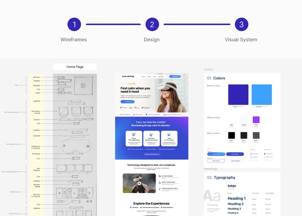
4. Funnel structure and wireframes
Mapped the conversion flow before a single visual decision was made.
5. A trust-first visual system for Baby Boomers
Larger type, higher contrast, shorter line lengths, calmer pacing. Designed for the person actually buying it.
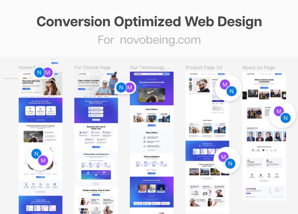
6. Five pages designed end to end in Figma
The complete flow, not a homepage refresh.
7. Dev-ready handoff and build support
Components, specs, notes, and support through implementation.
Six shifts that moved the number
1. Above-the-fold clarity
Who it is for and what it does, communicated in one screen.
2. A CTA system that guides
One path, repeated, instead of three competing buttons.
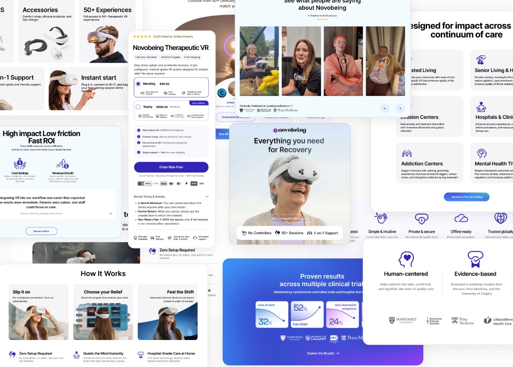
3. A trust stack built for health products
Credentials, proof and reassurance placed where hesitation happens.
4. Lower friction & cognitive load
Clear spacing and intuitive navigation throughout the entire buying path.
5. Accessibility as a conversion driver
Treated as a primary conversion decision, not just a compliance box.
6. Embedded objection handling
Written directly into the page flow, not buried in an FAQ.
Verified results after two months
Two months after launch
Across both periods
Rebuilt end to end
Sales more than doubled. The ad budget did not move.
How this was measured
All five pages launched together, so this is a before-and-after comparison across the full rebuild, not an isolated test of any single change.
Ad spend held steady across both periods and the traffic mix did not materially change, which is what makes the comparison worth reporting at all.
Founder Feedback
"He rebuilt five pages into one clear path to buy. Sales more than doubled after launch. Up 102%. We spent the same on ads."
Nik Vassev · Novobeing
Trust is a conversion layer
For anything expensive or personal, buyers do not leave because they do not want it. They leave because they are not confident yet.
Novobeing did not need a better product or more traffic. It needed the page to answer the questions its buyer was already asking silently.
More case studies

How Mosaibul Optimized Palazzo Couture's Funnel to Lift Conversion Rate by 50% in 30 Days